Branding in the Modern Age
A brand is a distinct design, tone of voice and set of values that makes a promise to your customer. It’s a promise of a consistent message that should be visible at every touchpoint with your customer.
A brand agency’s job is to create this message and fulfil this promise. And a strong brand will help you to succeed as a business. But the brand agency’s job has recently become much more complex — all thanks to the digital revolution.
As the digital world has grown and expanded, the work of a brand agency has changed too. New touchpoints and ways to communicate have been created and, more importantly, the digital landscape is always evolving, making it difficult to predict where and how a brand should be applied.
Developing a Digital Brand
Working across a huge range of industries, we often find brands don’t always think through all these digital contexts, and the assets that are required for a great digital marketing strategy. The problem is that not all brand agencies have experience in developing digital brands.
This can cause problems for our website designers, the client and the external branding agency. We have even had experiences of clients asking their agency to re-do the logo and brand after we have applied it to the website.
The Flex Digital guide to digital brand design
We’ve created this guide to help clients that are either developing their own brand or working with agencies that possess less digital experience. In either situation, following these guidelines will help you to develop a brand that is digital-ready and versatile enough to scale into the wider digital environment. We’ve come up with 13 points to consider when developing a digital brand.
1. Mocking up
The first thing a brand should consider is where it’s mostly going to be seen. If the brand is mostly a digital brand, treat it like one. Don’t mockup the logo onto a print brochure if the main marketing priorities are website and social media profiles.
Simply put, if the brand is based on digital platforms, mock it up on digital platforms.
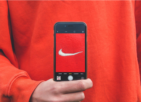
2. Logo
A key thing to consider when it comes to a logo design is how it will work on your website. We often see logos that are too tall, which usually means the logo doesn’t look right when placed in the top navigation bar.
Additionally, on a website the logo may be overlayed on an image and therefore needs to be visible against this image background. This isn’t a huge issue as a web designer can create a navigation bar that is not over an image, however, this usually relies on the logo being horizontally laid out so that the navigation bar isn’t too tall.
Another problem we often find is that the logo is overly complex and does not look good in smaller sizes, for example, responsive designs or mobile designs. This is why MasterCard recently rebranded to a more simple logo and a core driver for most digital brands.
We have also found that some logos are unsuitable for social media platforms. This means that the icon does not fit well into a square or circular profile picture. Or it doesn’t fit on an app splash screen, or a favicon, or other required locations.
If you’re developing a logo for a website, try to create a horizontal version. If it’s for social media and mobile, make sure an icon fits into a square. If it’s for an app or mobile website, check that it fits into the screens. Overall, make sure the logo is mocked up and tested in the right environments, and if you’re not sure what those environments are, get in touch for a chat.
3. Typography – Web Fonts
Web fonts are expensive and the licences are usually complicated. As a simple rule of thumb, we try to choose a Google font for a digital brand. This makes it easier and cheaper to implement the brand. The complexity of web fonts is often overlooked by print/brand agencies as it’s much cheaper to buy a font for print work. This does however limit a branding agency’s choice of typography.
There are other implications of paid fonts such as site speed or complications to site builds. With modern web technologies, this usually isn’t an issue but your development agency may not have budgeted for this and so a paid font should be talked through with them.
If an agency is going to choose a font that requires a licence, make sure they check the prices of the font licence, check how often you would have to renew the font license, and if required estimate how many monthly hits the website would have and therefore how costly it would be long-term. This should also be discussed through with the web designer/developer to ensure they are able to estimate their time correctly. You then need to get these costs signed off by the client and the client needs to budget accordingly for web fonts.
If you don’t find a free Google font that works for you and you don’t want to choose one that requires a licence, you could opt for a bespoke font. If you have the budget and are seeking a truly unique brand image, then a bespoke font would avoid licencing fees and provide you with a distinct look.
4. Typography — Font Weights
When choosing a font for the print, a design agency can sometimes rely on just one or two font weights. However, this is usually impractical for the web because there are is such a wider variety of screens and elements, and they have to work at all screen sizes.
Another problem here is how fonts render online. Print designers will use particular weights to create visual hierarchy but the web just can’t match it. Fonts are naturally jagged. However, smooth edges don’t exist in the pixel world. As such, design programmes like Adobe Illustrator, Photoshop and Indesign, automatically apply anti-aliasing to smooth out the edges of jagged letters.
When the font is used online, anti-aliasing is not applied and letters are left with jagged edges (jagged to fit pixels), making the letters appear a different weight. As such, you commonly have designers asking to “make the font thicker or thinner to match my design”. Some times this just isn’t possible with a font family that doesn’t have many weights. The more weights there are, the easier it is to find a font that matches the original design.
Our solution: make sure you choose a font with at least three or four different font weights, and ideally more. There may be exceptions to this, but it’s a good thing to watch out for.
5. Company Name
Finding a domain is hard; most short ones are taken. Choosing a name is hard; most good ones are taken and they often have SEO and branding implications. Getting a trademark can be hard; you need to make sure it’s available and that you won’t get challenged.
The solution is to learn the rules of domains, how to find them, how to come up with names and domain ideas, and how to select suffixes. Additionally, make sure you understand and check trademarks or come talk to us and we can connect you with IP specialists for you.
It’s surprisingly hard to come up with a name. Hopefully, you’re lucky enough to already have one or have a unique business name. Just make sure you and your branding agency understand domains, and don’t settle on a new brand name before you’ve checked that an appropriate domain exists for that name.
6. Rules That Don’t Apply to Responsive Design
This is probably the hardest one to explain. When doing print design you can keep editing the page until all the typography and spacing is perfect. However, on the web, you need to account for the fact that the design will appear on different sized screens and browsers.
Most people think this means you just need to design for desktop, tablet and mobile. However each of these screen sizes have a huge amount of variations and each browser could render the code slightly differently. As the browser and screen size changes the content moves, flows and stacks differently depending on the available space and the screen parameters, which can of course change.
There isn’t one solution to responsive design. It takes experience and thinking through each aspect. Essentially, you have to ask yourself…would this work on mobile? Would this work on tablet? Would this work if the screen size changes?
You also need to understand that different browsers and devices will affect aesthetics and that new features or elements may be developed that couldn’t be predicted at the start of the branding process. This means that being too rigid with your design rules just isn’t practical. The web needs flexibility. And instead of seeing that as an issue, you have an opportunity to develop a brand that has flexibility built into it. It’s a new type of challenge that asks for a design system instead of pixel-perfect images. Uncertainty can be seen as an opportunity to consider a brand at its fundamental level, instead of focusing on specific visual elements.

7. A Versatile Brand Element
As outlined above, the web requires flexibility. Often this means a good solution is to create a unique part of the brand that can be applied to a variety of situations. This doesn’t always need to happen, however we would usually advise creating a unique visual element which will be flexible and versatile as the brand grows. Examples of this in our own work would be the angle in Permagard or the line in Centreline or the dot in Symec. These elements are simplistic but versatile across different mediums. It makes a brand versatile and distinctive.
8. Favicons
When creating a logo, a lot of agencies start with the exploration of ideas and then mocking it up onto stationery, brochures or a single website page header. What is often overlooked, is whether the logo works as a favicon (an icon typically displayed in the address bar of a browser or list of bookmarks), on a mobile app icon or social media icon. This usually means, the logos we receive are overly complex and don’t have a simple version that looks recognisable at the small size of a favicon (16-32px), social media page icon or mobile app icons (64px).
We talked about this issue in points one and two, however it’s important to highlight the favicon as it’s at such a small size (16px) that this needs to be factored in if the brand is going to have a website. Make sure you mockup the favicon and test it at 16px. Additionally, make sure you mockup the logo in social media profiles, mobile app icons and other areas you need (see point two).
9. Icons or Illustrations
A brand could consider what its icons look like. Icons should usually be developed by the web design/development company and created during the process. However, some brand design agencies might want to have an input into the icon aesthetics. We would recommend doing this during the creation of the website as icons need to be adapted and changed in order to be fit for purpose.
Additionally, icons and illustrations should be tested to see if they work with all screen sizes, and if not, responsive icons should be considered. This is not often a big problem as web designers can develop new custom icons for the brand, but a brand agency may want to consider this from the start.
The company should also consider the cost of the icons. If they are extremely complex and the website requires a lot of them, this will become costly. Therefore, the cost of a custom-icon/illustration led approach should be considered.
10. Interactions and Animations
A detailed digital brand may consider the interaction and animation that are used. Some modern logos are now animated as they are mostly hosted on the web. Some brands might want to consider the loading icon and include that as part of the logo or brand design. A really unique brand may even consider web animation as part of the brand itself.
This is for more ambitious brands, but at a simple level, having an animated logo and loading symbol could be considered at the branding stage.
11. Accessibility Standards
The Web Content Accessibility Guidelines (WCAG) are the industry standard. This impacts designs, content creation, development and other areas. Not all businesses focus on accessibility (although, we think they should), but when it comes to public sector organisations, government websites and charities, it’s paramount.
“Web Content Accessibility Guidelines (WCAG) is developed through the W3C process in cooperation with individuals and organizations around the world, with a goal of providing a single shared standard for web content accessibility that meets the needs of individuals, organizations, and governments internationally”
A brand designer should understand the basic principles of web accessibility. You can read more about it at the link above or I will put a basic checklist of things to consider
Design
Images: make sure that text meets contrast and visibility standards when over images. Remember to consider that the size, shape and positioning of the text and image can change with different screen sizes.
Colours: ensure the contrast between text and background colours meets basic web accessibility standards. You can use this contrast checker here. Additionally, check whether colours work as light text on dark background as well as dark text on light backgrounds (an extra tip is to visually check whether it’s easy to read. Not all text that passes contrast checks is easy to read)
Links: make sure your links describe what the link is doing or where it is going. This can also be added to with alt tags.
Forms: check that form fields have labels next to them which explain what data is required
Development
Images: all images need alt tags.
Text: ensure that your text can be made larger without affecting the content or function of the page or site and make sure you don’t use images of text for decorative sake.
Navigation: ensure the website can be accessed without a mouse. Ensure that the reading and navigation order is logical and intuitive. Check that the website can be navigated through using Shift, Tab, and Enter on the keyboard.
Timing and flashing: ensure that page elements that require a time limit or change after a period of time, can have the time adjusted or removed. Also, avoid flashing content.
Content
Video: ensure you have subtitles, captions or written transcripts with video and audio content and avoid extreme flashing images in your video.
Audio: if there is audio that plays automatically on a website, ensure that these sounds can be paused or stopped by the users.
It’s important to remember that accessibility should be more of an open conversation rather than a clear checklist of things to do. Making the site accessible is not difficult but it will take consideration from all parties and an open conversation about it. But brand designers would do well to understand the rules of accessible design and consider the implications.
13. Style Guide and Values
As most agencies already know, the brand should be built around the values. Those values can stay fixed while the visual identity evolves to match new assets, contexts and trends. This means, as different contexts are considered by the brand agency and software house, the brand can grow and adapt.
Any brand should be pragmatic, not dogmatic and this means the values should be at the core and the visual rules can grow and change as the digital landscape grows and adapts. This means you should stay flexible and evolve the style guide while assets develop, instead of creating rigid rules for situations that haven’t properly been considered yet.
For a designer, this means making sure you’re including values in a brand and explaining why visual elements have been chosen. But also it means thinking about the brand as a value system and visual system that can be applied to many elements. It means creating flexible principles, not dogmatic rules.
A Digital-ready Brand
We hope that this guide will help you to understand the specific ways to build a great digital brand. And even more than that, we hope we’ve convinced you that in order to keep your brand promise and build a consistent message, you need to build more than a visual look and feel or book of rules — you need a design system underpinned by values. And you need a system that incorporates flexibility and digital requirements from the start.
If you’d like to know more about how we can help you or your brand agency to develop a digital-ready brand, get in touch at our website here.